Understanding the Importance of Font Selection
Why Fonts Hold More Power Than You Think
Imagine wearing a bracelet engraved with a message in Comic Sans. Feels off, right? That’s the magic and menace of font selection—it can transform a heartfelt inscription into something whimsical, dignified, or downright puzzling. Fonts aren’t just letters; they’re emotions. They whisper (or scream!) your story to the world.
The way a word looks impacts how it’s read. A sleek, modern sans-serif like Helvetica speaks of simplicity and elegance. Meanwhile, a flourishing script font like Edwardian Script carries an air of romance and sophistication. The wrong choice? It can muddle your intent faster than you realize.
Fonts as Style Statements for Bracelets
When it comes to custom bracelets, fonts do more than “look nice.” They are:
- The tone-setters: Is your bracelet playful, wise, or sentimental?
- Emotion amplifiers: A minimalist sans-serif conveys calm, while a gothic typeface may evoke a bold, edgy vibe.
- Legibility influencers: An ornate font might dazzle on-screen but become unreadable when downsized for jewelry.
Choosing the right one is like finding the perfect soundtrack to your favorite memory—it just fits.
Factors to Consider When Choosing a Font
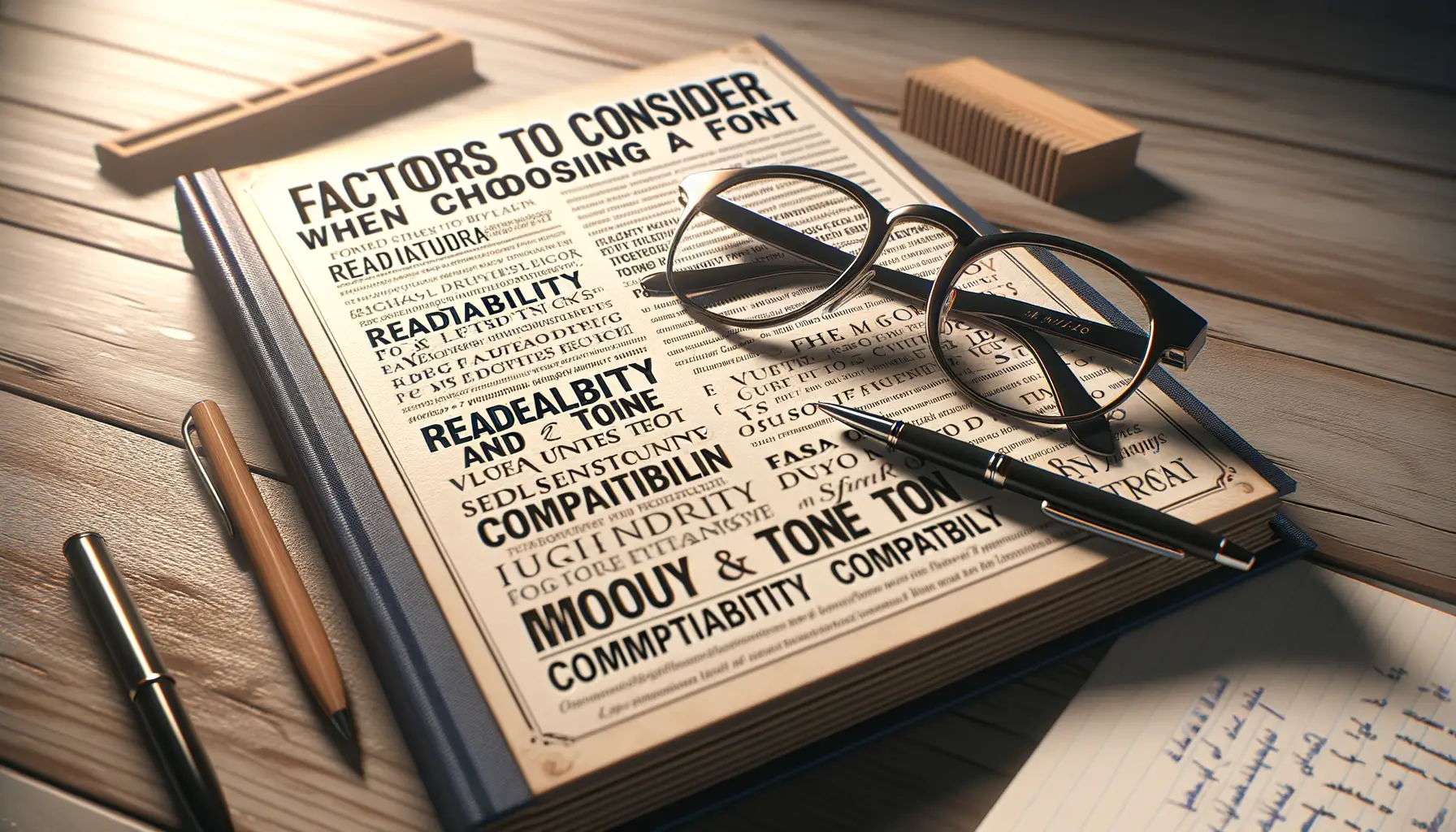
Why Your Font Choice Speaks Volumes
Imagine your bracelet is a blank canvas, and the font is the brushstroke that tells your story. Choosing the right font isn’t just about aesthetics—it’s about capturing emotions, memories, and personal style. That dainty script may whisper elegance for a wedding gift, while bold and blocky fonts scream confidence and individuality.
Think about *readability*: will the words you choose shine through clearly on your chosen material? A delicate serif might look beautiful in theory but could get lost when etched onto a smaller surface like a bracelet. And what about the size of the font? Smaller fonts can be subtle and sleek, while larger fonts grab attention.
Practical Tips for Perfect Font Selection
It’s also worth asking yourself: *What’s the message?* Different fonts evoke different vibes. Here’s a quick breakdown:
- Playful and fun: Go for rounded, bubbly fonts like Comic Sans or Pacifico.
- Timeless and classy: You might love classic options like Times New Roman or Garamond.
- Modern minimalism: Sleek sans-serif fonts, like Helvetica or Lato, work wonders.
And don’t forget your bracelet material—engraving a delicate cursive onto stainless steel might look stunning, but those same swooping lines could disappear on leather.
Popular Font Styles for Bracelets
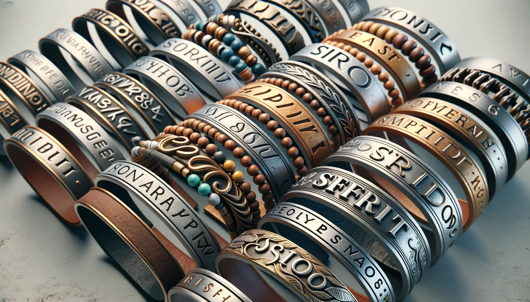
Timeless Fonts That Steal the Spotlight
When it comes to bracelet engraving, some font styles stand out for their charm and versatility. Picture this: you’re holding your custom bracelet, and the font feels just as perfect and meaningful as the message it carries. That’s the magic of choosing the right style!
Here are a few crowd favorites that people keep coming back to:
- Elegant Script Fonts: Think flowing, sophisticated handwriting. These are perfect for romantic or sentimental messages like “Forever in My Heart.” Popular examples include *Edwardian Script* and *Snell Roundhand*.
- Modern Sans-Serif Fonts: Clean and contemporary, fonts like *Helvetica* or *Arial* bring a sleek aesthetic. They’re perfect for those aiming for simplicity with bold clarity.
- Classic Serif Fonts: With their timeless, bookish feel, serif options like *Times New Roman* or *Garamond* say, “This message means business, with a hint of nostalgia.”
Quirky and Personalized Options
For those wanting something unique, why not try monogram fonts? These fonts transform initials into tiny works of art. Or perhaps explore *handwritten fonts* for a charming, one-of-a-kind touch—perfect for recreating a child’s handwriting or capturing your own personal flair. Whatever you choose, let the font be a reflection of YOU.
How to Match Fonts with Bracelet Styles
Finding Harmony Between Fonts and Bracelet Designs
Pairing the perfect font with a bracelet style is like finding the perfect dance partner—they need to move together in harmony. Imagine gifting a delicate, minimalist bracelet with a bold, chunky font. It’s a mismatch, right? Instead, you want the font to complement the bracelet’s personality, not overshadow or clash with it.
Here’s a little cheat sheet to spark your creativity when matching fonts to bracelet styles:
- Classic Metal Cuffs: Opt for sleek, timeless fonts like serif styles (think Times New Roman or Georgia) to enhance the bracelet’s sophistication.
- Leather Wrap Bracelets: Go rustic or boho with handwritten or script fonts like Pacifico or Dancing Script—think carefree and earthy vibes.
- Beaded Bracelets: Casual sans-serif fonts (like Arial or Lato) feel approachable and laid-back, mirroring the bracelet’s easygoing charm.
- Charm Bracelets: Choose playful fonts like Comic Sans or Lobster that reflect whimsy, youthfulness, or cherished memories.
Let the Bracelet Speak
Your bracelet whispers its vibe—listen closely. If it’s minimal and chic, less is more. A subtle font keeps things elegant. For bold or edgy designs, go daring! Picture a black leather cuff engraved with Gothic-style lettering—it packs a punch. And don’t forget size matters. Tiny, intricate engravings on thin bracelets call for crisp, legible fonts, while larger pieces invite creativity.
So, visualize the whole look. Picture the font and bracelet as a duo telling the same story—your story.
Tips for Finalizing Your Font Choice
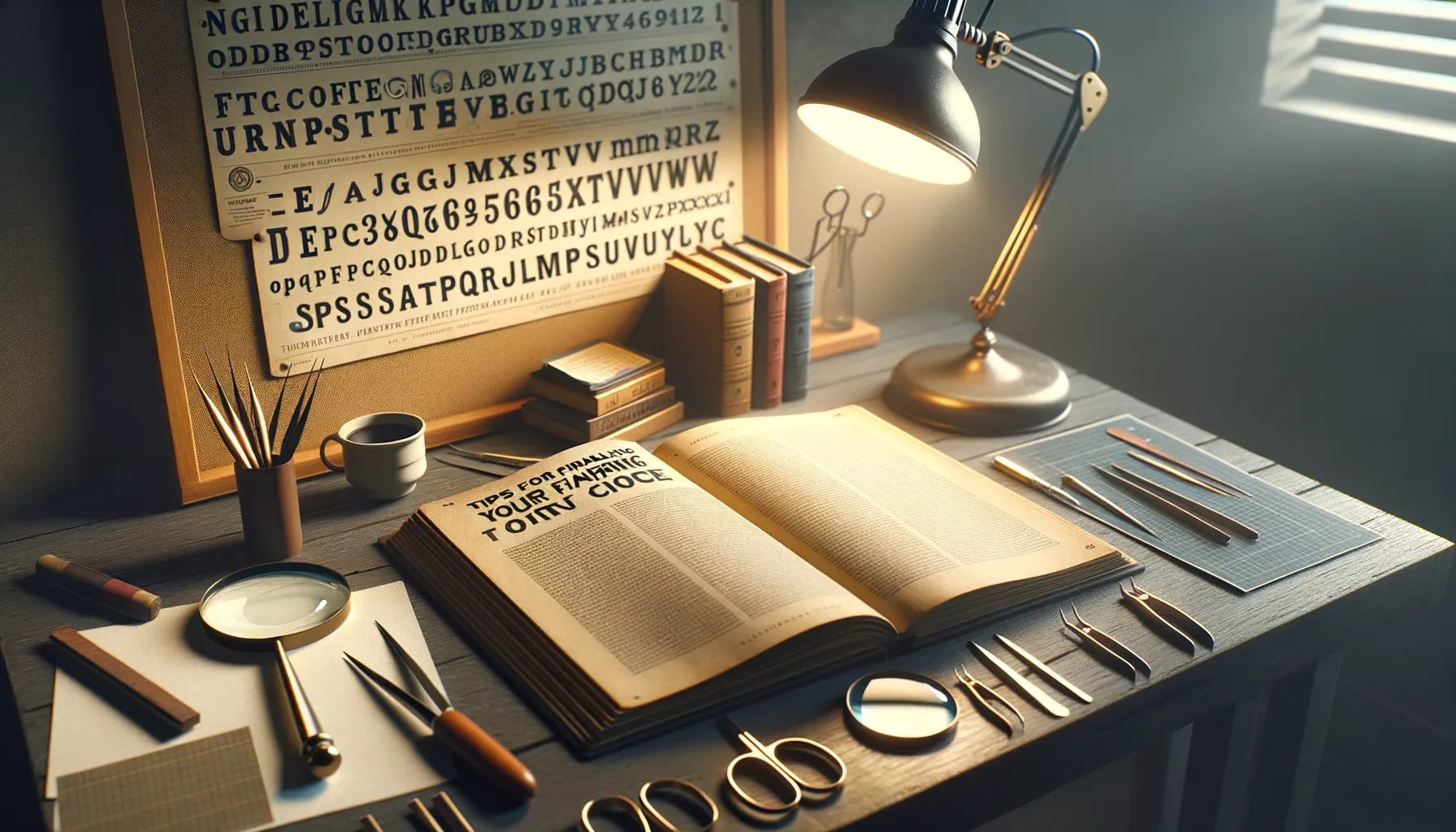
Think About the Story You Want to Tell
You’re not just picking a font; you’re shaping the voice of your bracelet’s message. Is this a gift for someone who’s all about elegance and timeless style? Consider a flowing, cursive font like Scriptina. Or maybe it’s for someone bold and unapologetically edgy—then a strong sans serif like Futura might speak their vibe. The font isn’t just decoration; it’s emotion in print. Ask yourself: “Does this font feel like *me*… or them?”
Test It Like You’re Trying on Shoes
Here’s where the magic happens—try out a few fonts with your chosen phrase or name. Seeing is believing! Experiment with different combinations and notice what clicks. To help guide your inner designer:
- Write out the name or words in ALL CAPS, lowercase, and a mix of both. Different fonts shine in different formats.
- Visualize how the font size will look on the bracelet. A delicate font might lose its charm if it’s too tiny to read!
- Play with contrasts. Pair a minimalist bracelet design with a striking, artistic font—or vice versa.
Trust your instincts; when it feels just right, you’ll know!